Brand Identity, Graphic Design, and Merchandising
S. G A R C I A
Create branding for a young small business based in Austin, Tx. Focused on a clean and sleek appearance with southern charm.
THE PROMPT
S. Garcia is a young Latino-American–owned business that is driven by a strong sense of professionalism and a clear vision for growth in its formative years. The brand draws inspiration from playful logotypes while maintaining a firm commitment to readability, striking a thoughtful balance between personality and clarity. This approach allows the identity to feel approachable and distinctive without compromising its credibility, positioning S. Garcia as both engaging and trustworthy as it continues to evolve.
PROPOSALS AND GOALS
Fenwayparkjf is a dynamic, movable typeface that emanates Southern charm, characterized by its bold, confident, and expressive presence. This is contrasted by Zumme, whose design leans into sharper precision and more controlled, modern forms. Together, their contrasting characteristics create a compelling typographic pairing, balancing charm and strength with clarity and sophistication.
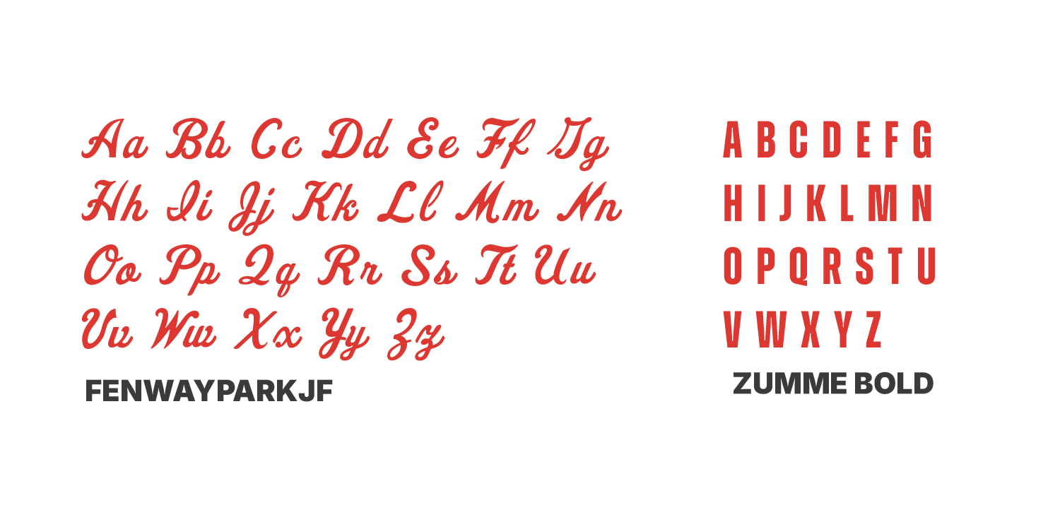
TYPEFACES

COLOR PALETTE
This minimal color palette is intentionally designed to allow room for future growth, evolving alongside the company as its needs expand. By keeping the foundation simple, it creates flexibility for additional colors and applications over time. The red serves as the primary focal point—an eye-catching, energetic accent that draws attention and anchors the visual identity, while the rest of the palette remains understated to support and enhance its impact.